

Startup Estonia
Redesigning the startup journey to help international founders discover, understand, and navigate Estonia’s startup ecosystem
The challenge
Startup Estonia was preparing to launch a new website and wanted to evaluate whether its content, navigation, and information architecture supported the needs of startup founders.
A key focus of the project was redesigning the “Why Estonia?” page to better communicate the benefits of Estonia’s startup ecosystem and help international founders understand why Estonia is an attractive place to build and grow a startup.
Methods
Desk Research, Heuristic Evaluation, Accessibility Evaluation, Semi-Structured Interviews, Card Sorting, Thematic Analysis, Persona Development, Touchpoint Mapping, Information Architecture, Prototyping
Team
Claudia Diaz Reyes, Yun Ho Ling, Faith Emike Igbafe, Nataliia Chobotok
Duration
3 Months
Research
A mixed research approach was used to evaluate the new website and understand how startup founders navigate the Startup Estonia ecosystem, what information they look for, and how the website could better support their decision-making.
→ Desk research
Were reviewed Startup Estonia’s existing materials, including the brandbook, Startup Visa resources, ecosystem documentation, previous personas, and promotional content. Additional research explored Estonia’s startup ecosystem, startup relocation, legal processes, and the needs of startup founders before beginning user research.
→ Heuristic & accessibility evaluation
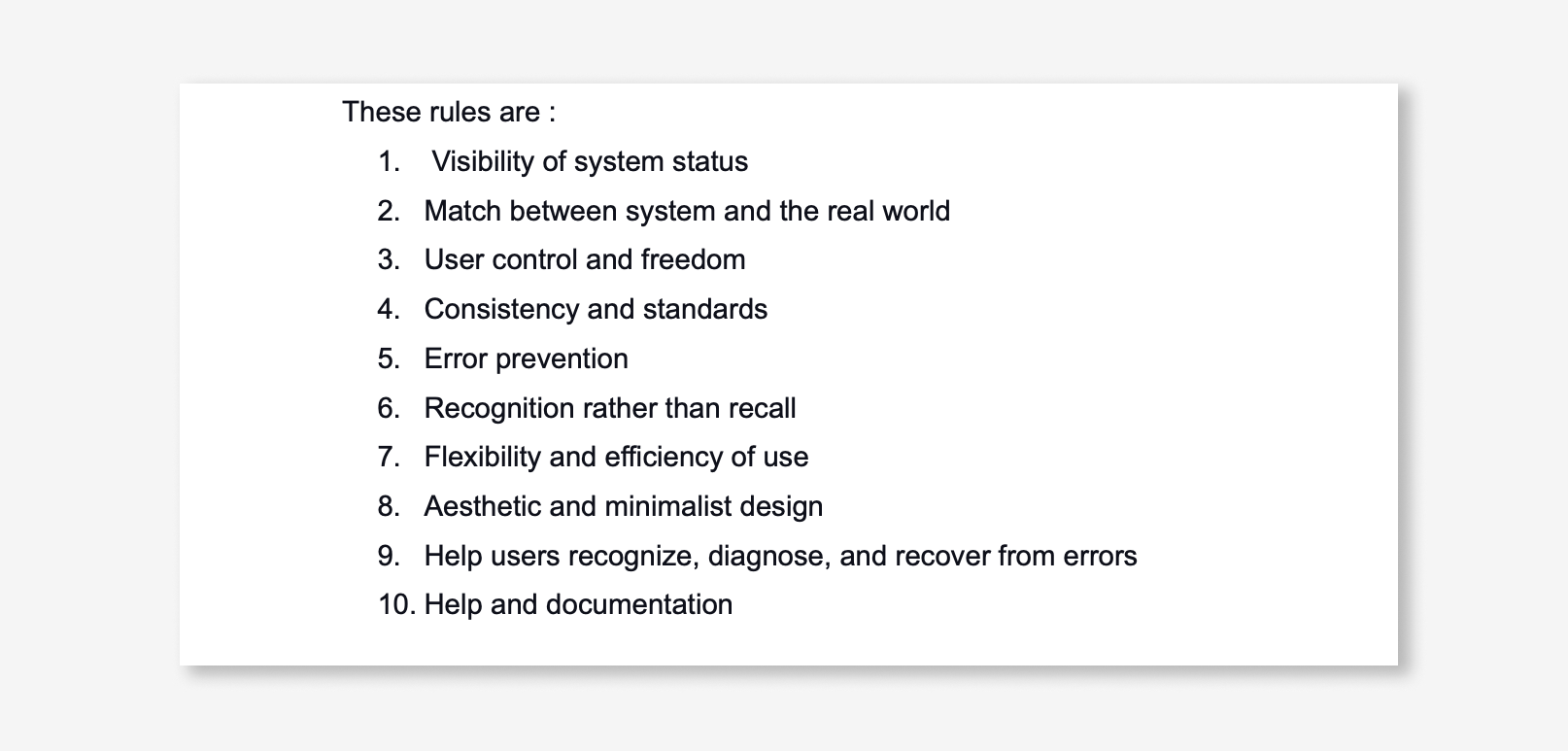
The existing website prototype was evaluated using heuristic and accessibility principles to identify usability issues before launch. The evaluation focused on navigation, readability, accessibility, and overall usability.
→ Interviews with startup founders
Semi-structured interviews with local and international startup founders explored their experiences, needs and challenges when building a startup in Estonia. The interviews also looked at how they used the Startup Estonia website during this process.
→ Card sorting
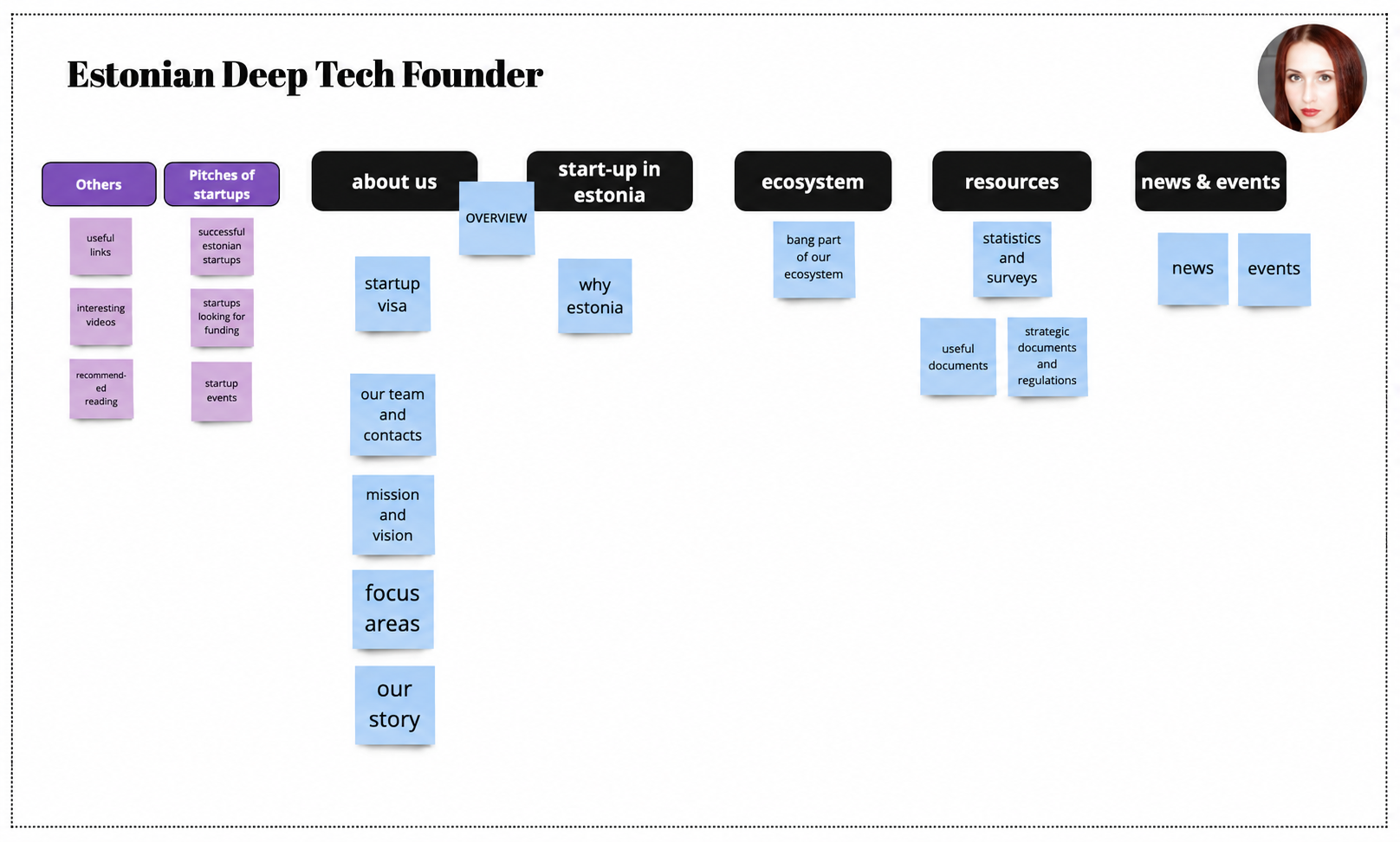
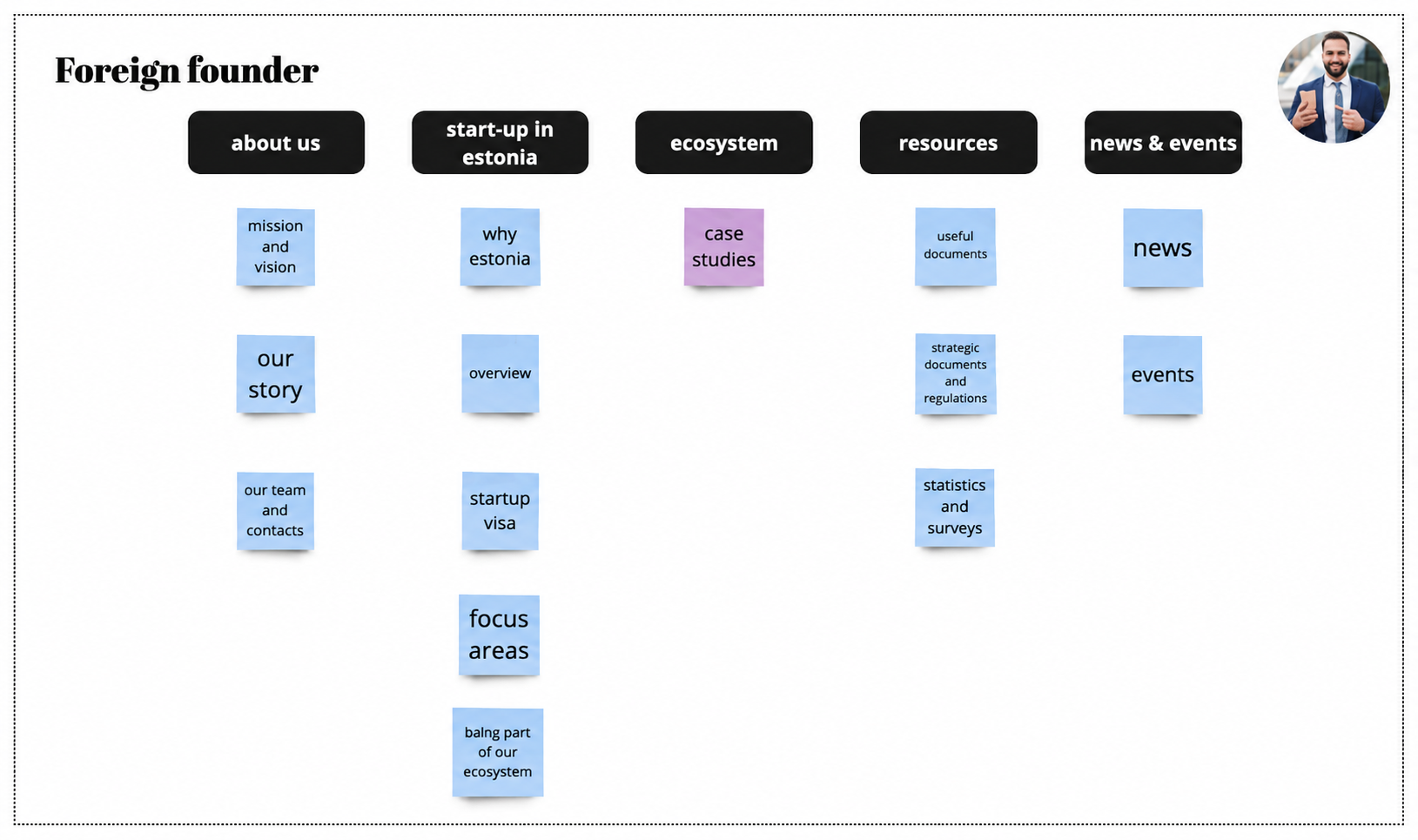
A mixed card sorting exercise was conducted after each interview to understand how founders organised website information. Participants grouped existing navigation items, suggested missing content, and explained their decisions using a think-aloud approach. The results were later used to improve the website’s information architecture.
→ Persona development
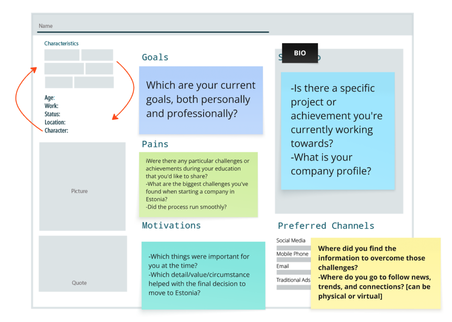
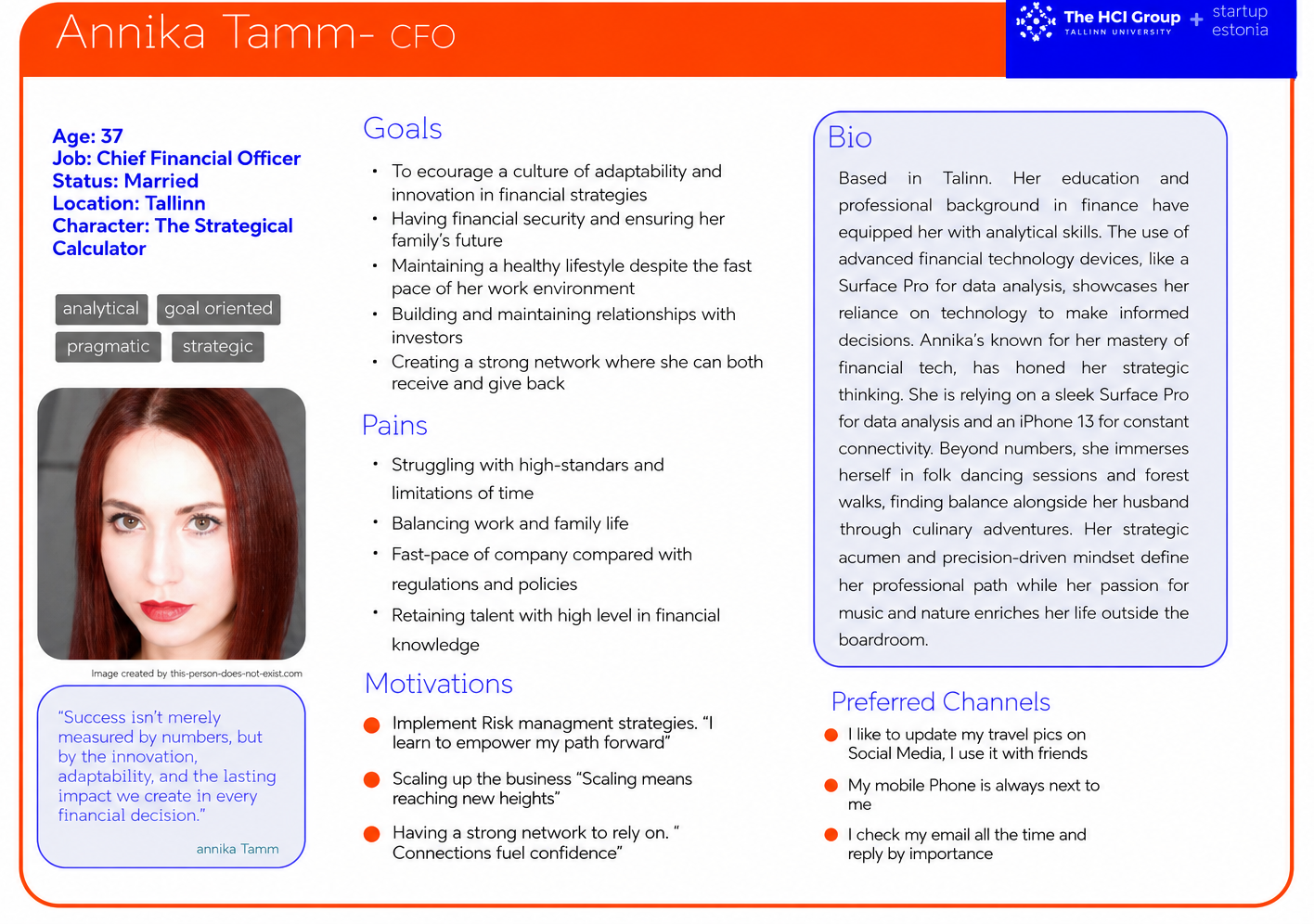
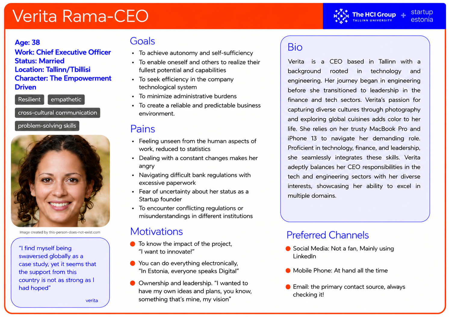
Research findings showed that local and international founders have different goals, motivations, and expectations. Based on these insights, two personas were refined to represent the primary user groups and guide the design of the “Why Estonia?” page.
Key Insights
→ Startup founders look for practical guidance
Participants wanted easy access to legal information, templates, government support, and practical resources that help them establish and grow a startup in Estonia.
→ International founders need stronger reasons to choose Estonia
The “Why Estonia?” page should clearly communicate the key benefits of building a startup in Estonia, from government support and taxation to legal processes and the local startup ecosystem.
→ Navigation should better reflect founders’ expectations
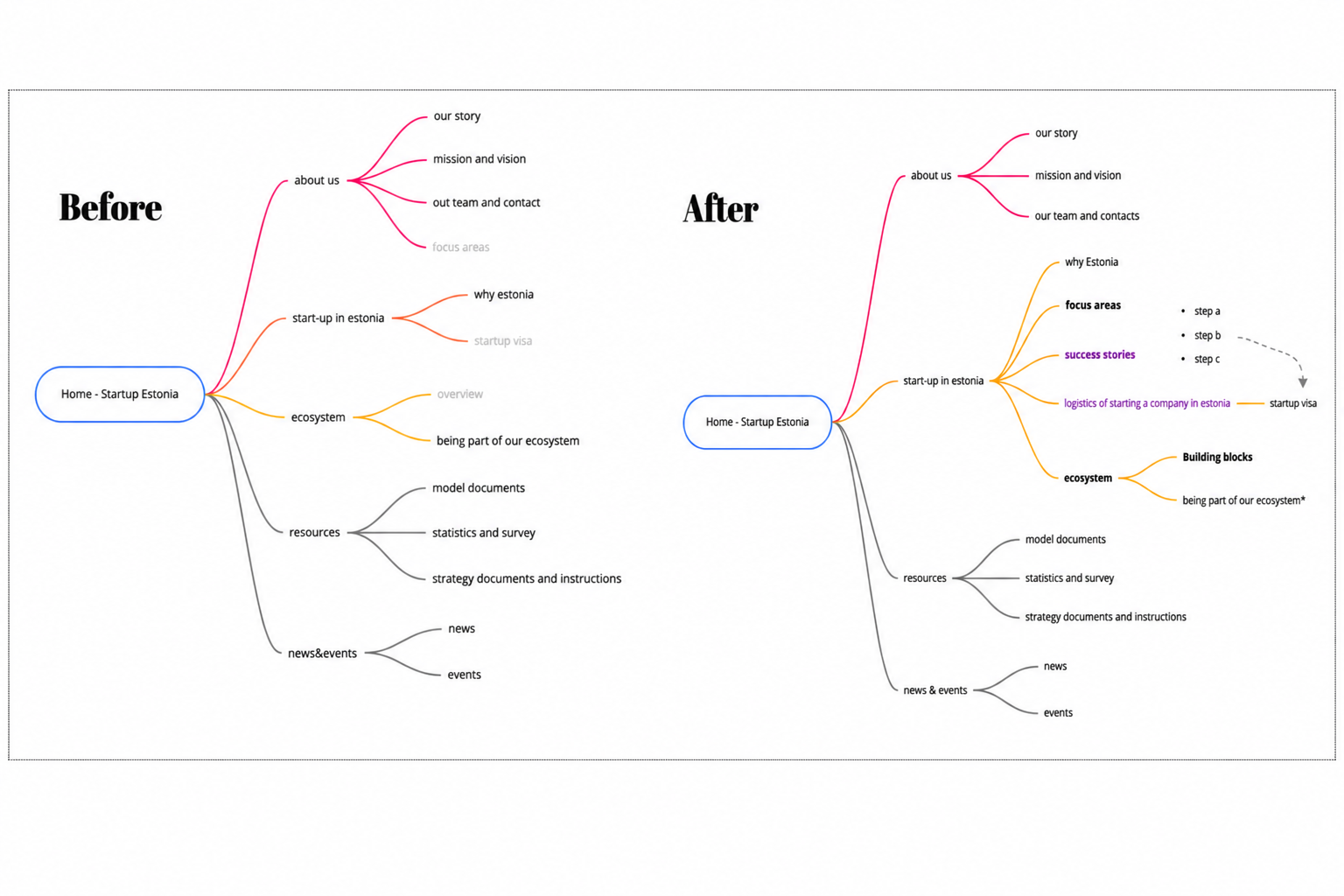
Card sorting revealed opportunities to improve the website’s information architecture by making important sections easier to discover and understand.
→ Startup ecosystem resources should be easier to find
Participants expected quicker access to ecosystem platforms, investor resources, startup support, and related services.
→ Founder stories increase trust
Real experiences from startup founders can strengthen the credibility of the website and help international founders better understand the Estonian startup ecosystem.
Design Solutions
Research findings informed recommendations for improving the website structure and redesigning the “Why Estonia?” page.
→ Improved information architecture
Problem – Important information and resources are not always easy to find.
Solution – Navigation was reorganised based on card sorting results to create a clearer structure for startup-related information.
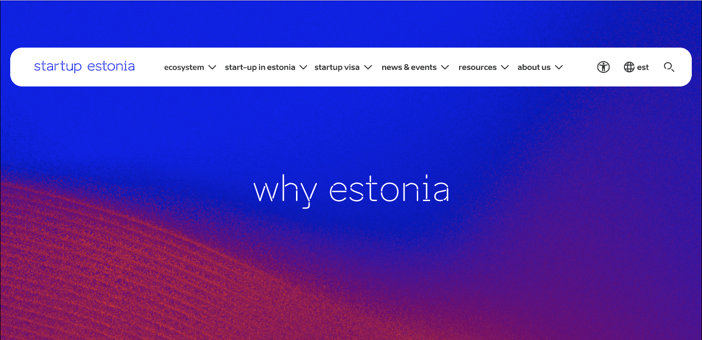
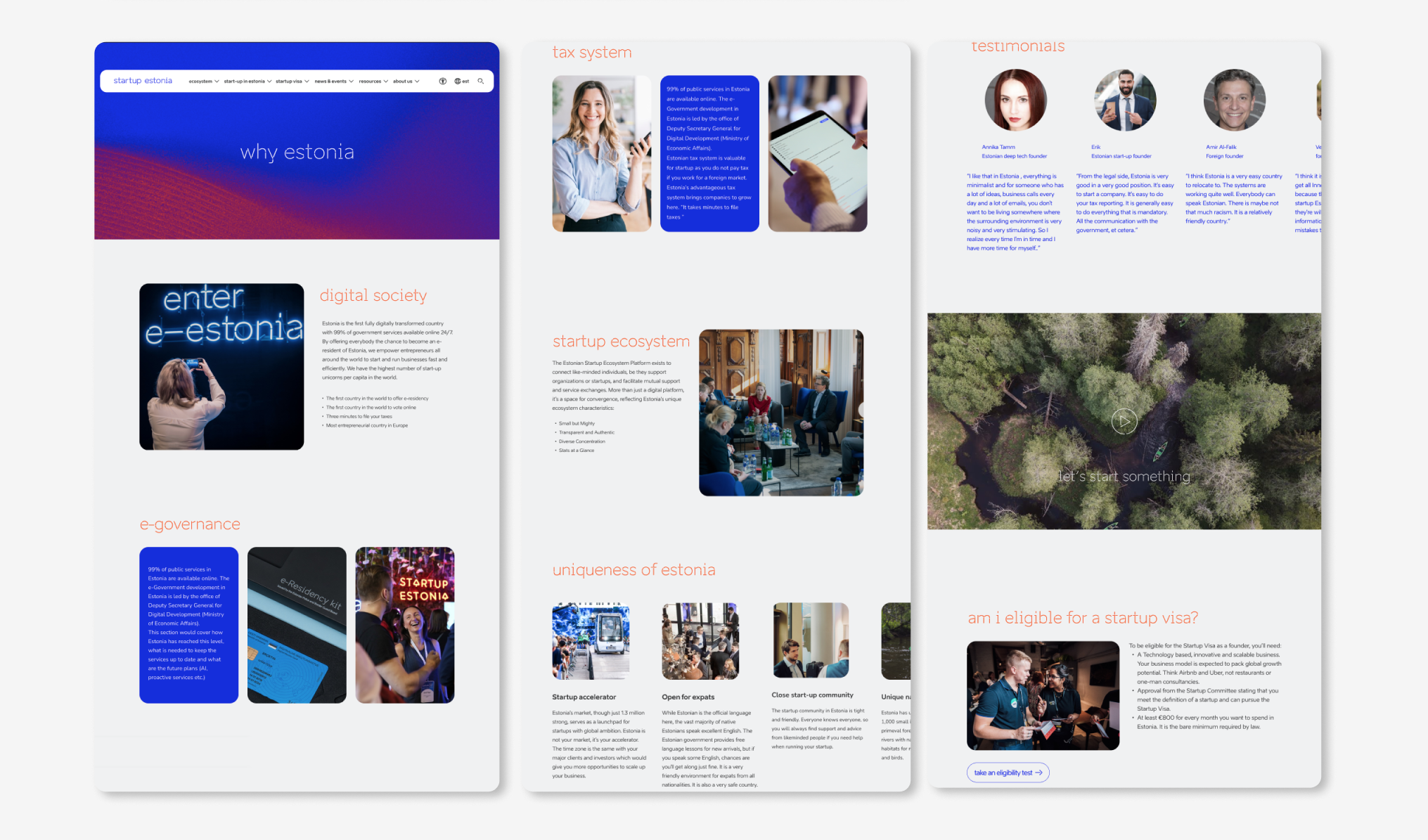
→ Redesigned “Why Estonia?” page
Problem – The existing page does not fully explain why Estonia is an attractive place to build a startup.
Solution – The redesigned concept highlighted the benefits founders identified during the research, including the startup ecosystem, government support, taxation, legal processes, and business environment.
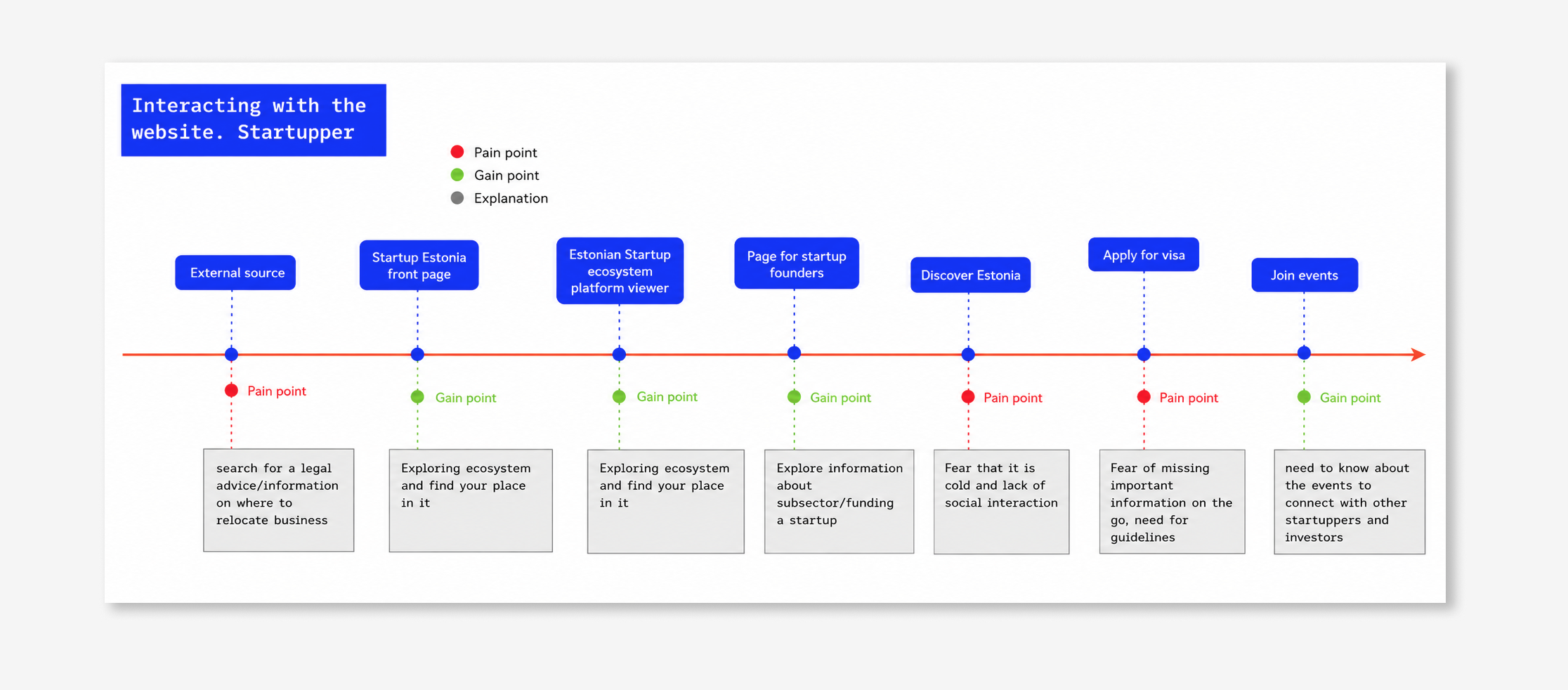
→ Supporting the founder journey
Problem – Startup founders search for information from different sources before deciding to start a company in Estonia.
Solution – The redesigned “Why Estonia?” page was structured to better support this journey by presenting relevant information at the right stage of the decision-making process.
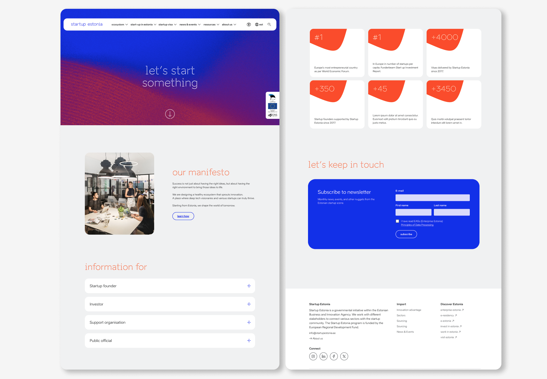
→ Dedicated entry points for different audiences
Problem – The website does not clearly guide different users to the information they need.
Solution – A landing page was designed to help users quickly choose their role and find the right information.
Usability Testing
The “Why Estonia?” prototype was tested with one international startup founder due to limited project time. The session explored whether the content and information structure matched the needs of startup founders. Feedback from the testing, together with findings from interviews and card sorting, helped improve the page before the final prototype was created.
Outcome
User research helped improve both the website structure and the way information is presented. The findings were used to create clearer content and make important information easier to find, especially for international founders. The final outcome was a redesigned website concept with practical recommendations for improving the user experience.