

UXMust
Turning UX evaluation findings into clear, prioritised, and actionable improvements
The challenge
UXMust helps companies identify usability problems through heuristic evaluation. However, finding issues was only one part of the process. The existing platform produced reports, but users often did not act on them. Recommendations were difficult to interpret, progress could not be tracked, and collaboration was limited to a single point of contact.
The project aimed to redesign UXMust so that designers, product managers, developers and business stakeholders could understand findings, agree on priorities and move from evaluation to implementation more easily.
Methods
Heuristic Evaluation, Stakeholder Interview, Desk Research, Competitor Benchmarking, Semi-Structured Interviews, Thematic Analysis, Persona Development, User Stories, Prototyping, Usability Testing
Team
Kevin Otto Koit, Ayushi Raina, Zain Ul Abideen
Duration
3 Months
Research
The project followed the Double Diamond framework, moving from understanding the existing platform and its market to defining user needs, developing design concepts and testing the final prototype.
→ Existing platform evaluation
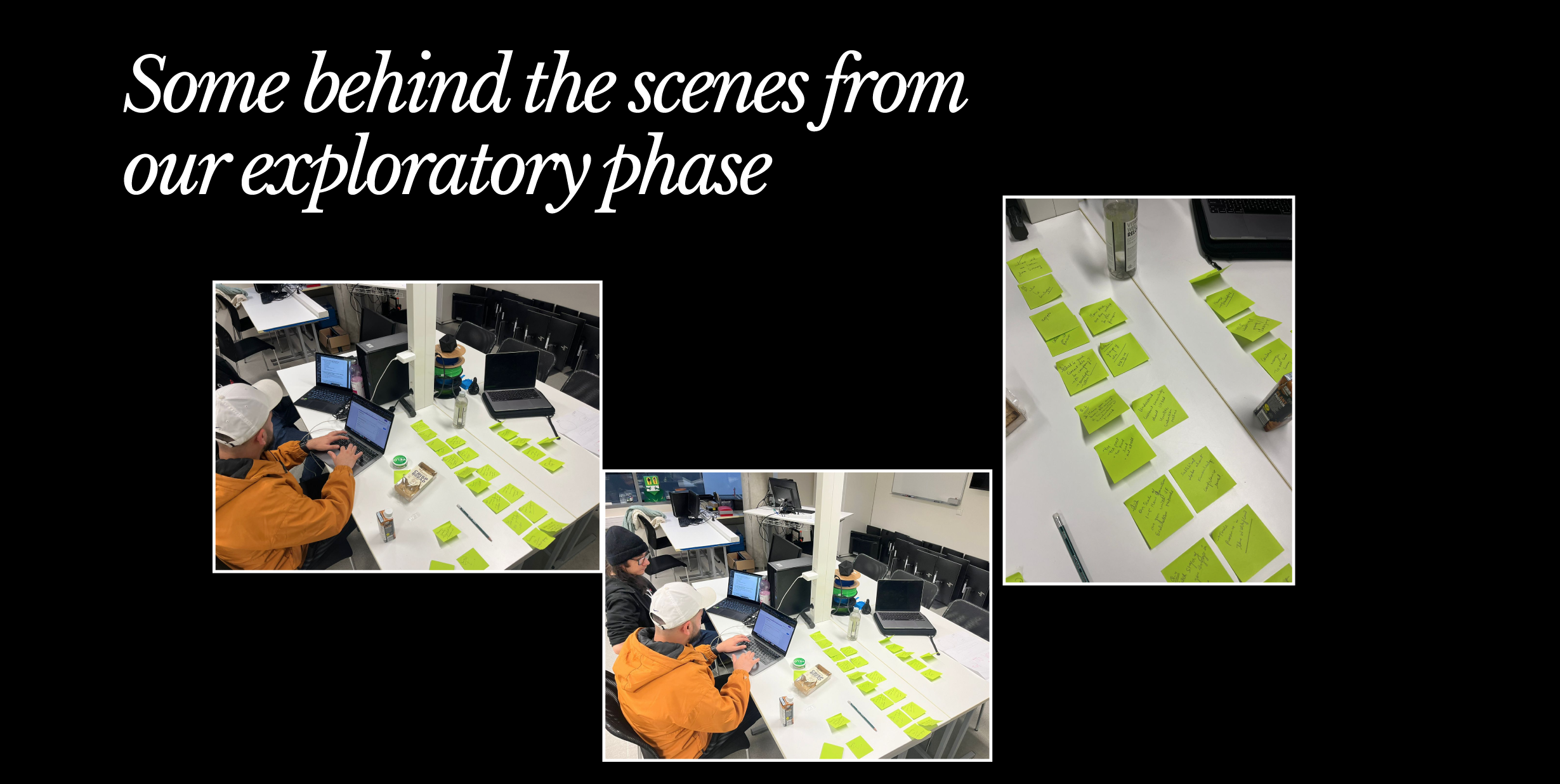
The existing UXMust platform was evaluated using its own evaluation tool after reviewing Nielsen and Norman’s usability heuristics. Additional evaluations of other websites helped identify the tool’s strengths and limitations from a user’s perspective.
→ Competitor benchmarking
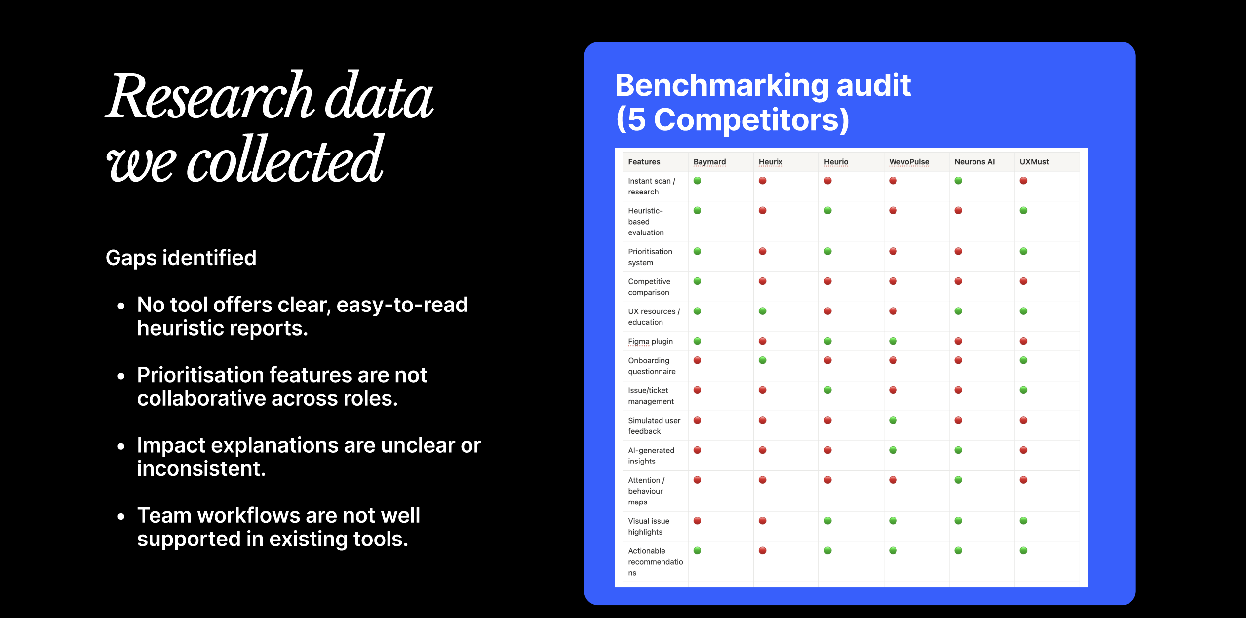
Five direct competitors and two indirect competitors were analysed to understand how other platforms approached UX evaluation, reporting, prioritisation, automation and collaboration.
→ Questionnaire, interviews & thematic analysis
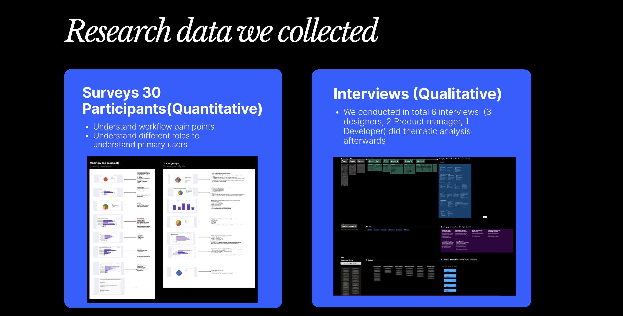
The questionnaire revealed how UX evaluation practices differed across professional roles, while six follow-up interviews explored what happened after evaluation reports were delivered. The findings highlighted organisational and communication barriers that often prevented UX recommendations from being implemented.
→ Persona development
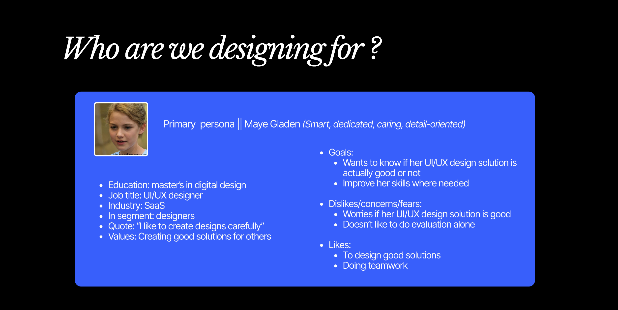
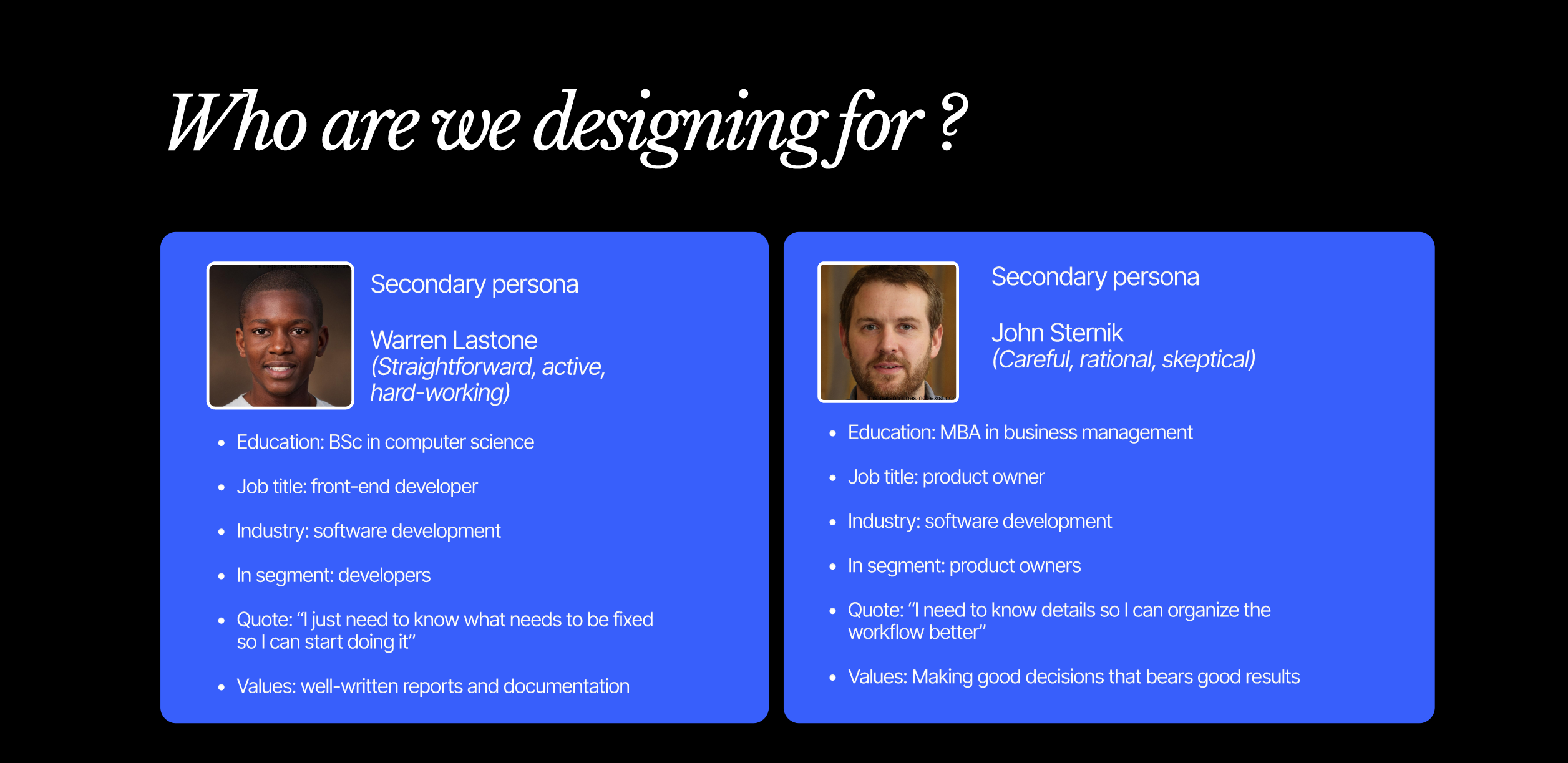
The questionnaire and interview findings were translated into three personas representing a designer, a product owner, and a front-end developer. The personas reflected how each role works with UX findings, highlighting different needs for evidence, prioritisation, business impact, and implementation guidance.
→ User stories and storyboard
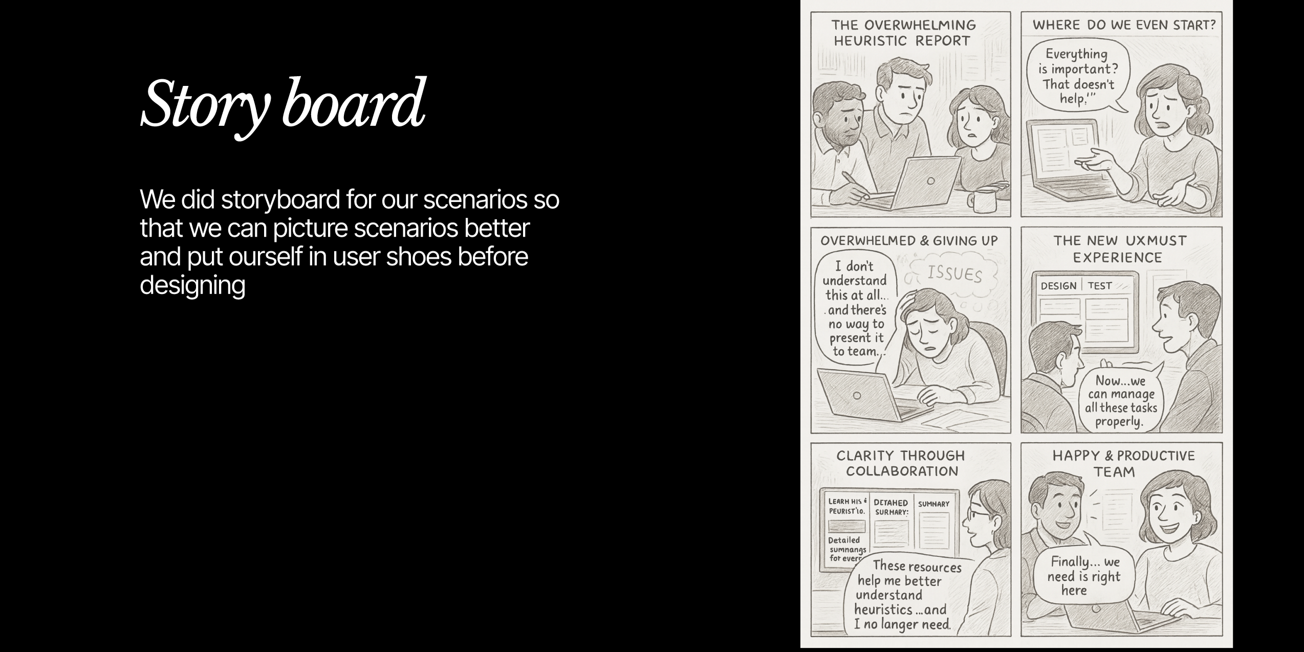
Four user stories were created for designers, product managers, developers, and business leaders to define the information each role needed from the platform. A storyboard then visualised the journey from receiving a complex heuristic report to understanding findings, collaborating with colleagues, and moving towards implementation.
Key Insights
→ UX reports often identify problems without helping teams solve them
UX reports often remain unused when they are too technical, too long, or lack clear next steps. Identifying usability issues alone is not enough — teams also need to understand their priority, assign ownership, and track implementation.
→ Different roles need different levels of information
Designers, product managers, developers and business stakeholders approach UX findings differently. Designers need detailed evidence, product managers need business impact and feasibility, developers need implementation context, and leaders need a concise overview of progress and results. A single static report cannot serve all these needs equally well.
→ Cross-team misalignment slows down implementation
UX improvements often depend on approval and coordination across design, product, technology and leadership. Different priorities, unclear ownership and repeated discussions create delays and make it difficult to turn research findings into completed changes.
→ Reports need to be clear, concise and actionable
Users need enough evidence to trust the findings, but not so much information that the report becomes overwhelming. Severity, business impact and practical recommendations need to be presented together so teams can understand what matters and decide what to do next.
→ Usability knowledge is not shared equally across teams
Not every user understands heuristic terminology or has experience with formal UX evaluation. Technical labels that are meaningful to a UX specialist can be confusing to a developer, manager or business stakeholder. The platform therefore needs to communicate findings in language that connects usability problems with their practical impact.
Design Solutions
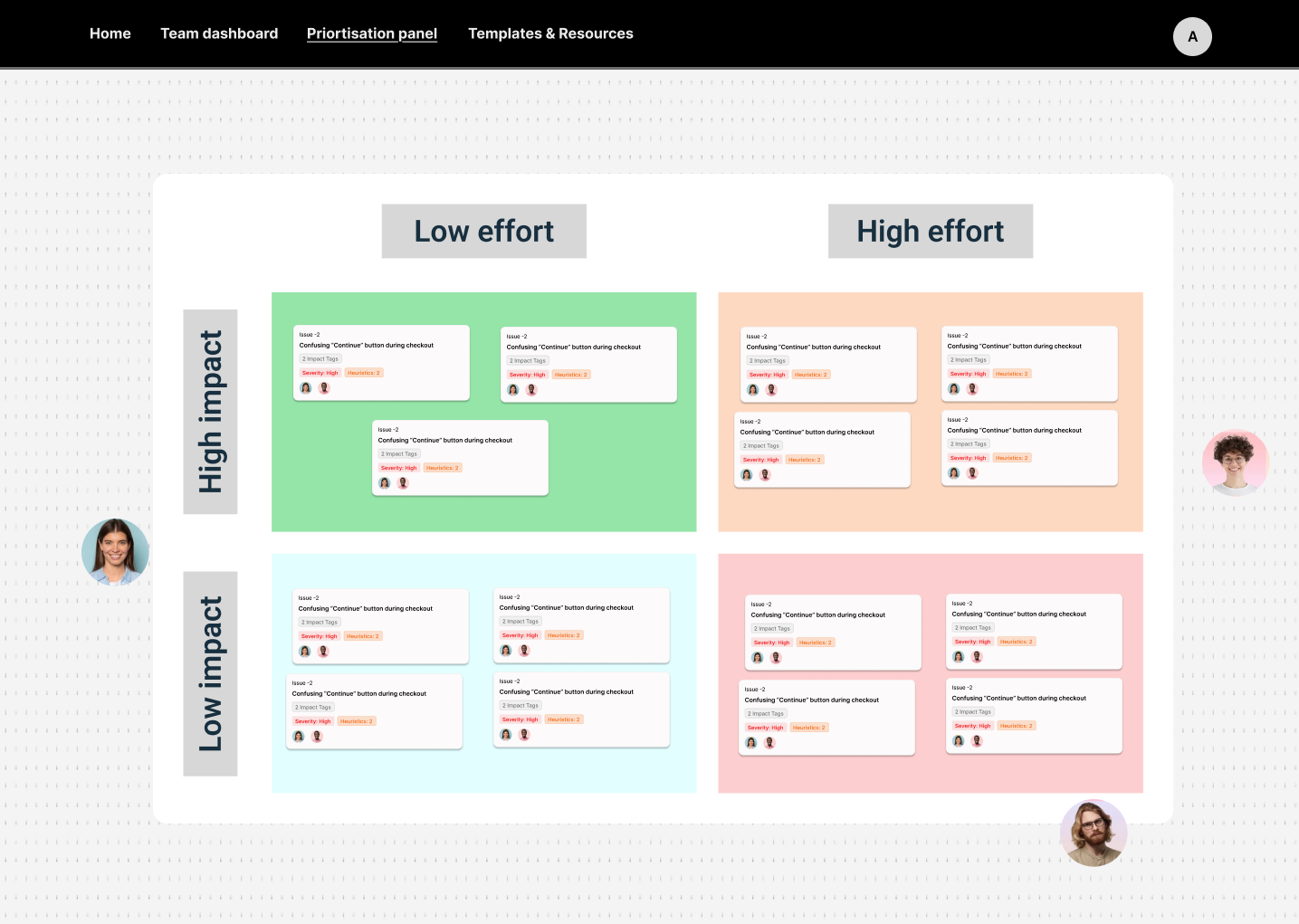
The research shifted the project from designing another report interface towards creating a more action-oriented workspace. The final concept was built around three main scenarios: reviewing an AI-generated audit, prioritising findings and supporting the developer’s implementation flow.
→ AI-generated audit overview
Problem – Users need a faster way to understand the overall condition of a website without reading every issue individually.
Solution – The concept introduced an overall UX summary with a visual score, severity information and an overview of key findings. Business and product impact labels were added to help designers explain why an issue mattered beyond the heuristic itself.
→ Shared team decision-making
Problem – Designers, product managers and developers often have different opinions about the effort and value of a proposed improvement.
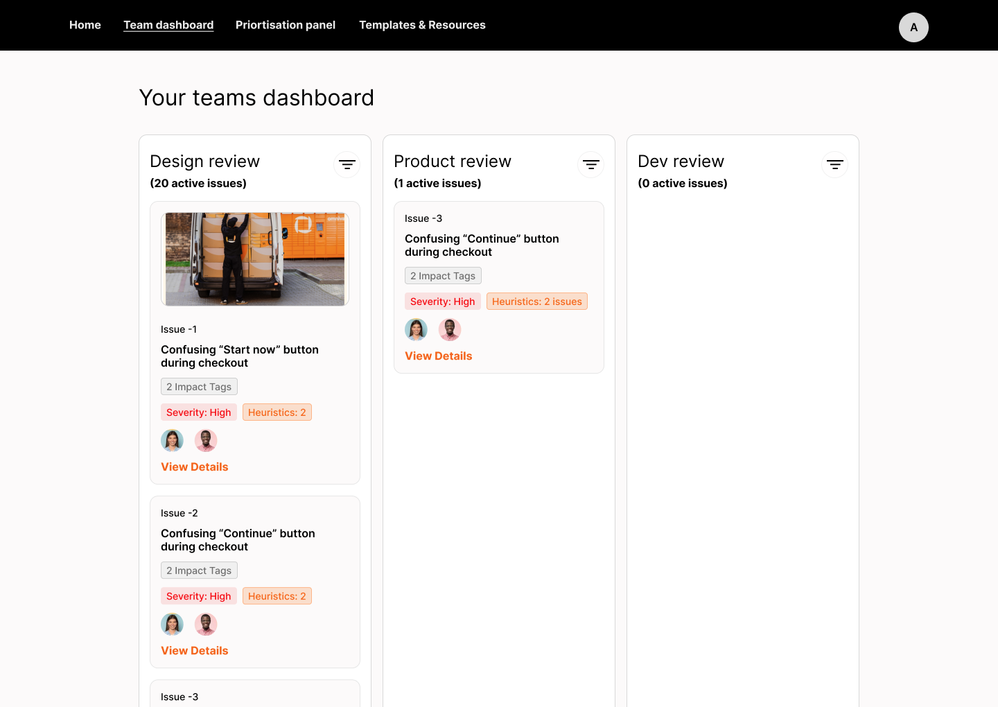
Solution – The concept allow several team members to contribute their effort estimates. These inputs could then support a shared “Balanced Decision,” making different professional perspectives visible within the same workflow.
→ Clear developer flow
Problem – Developers need clear, approved UX issues with enough context to understand what to change without extra discussions.
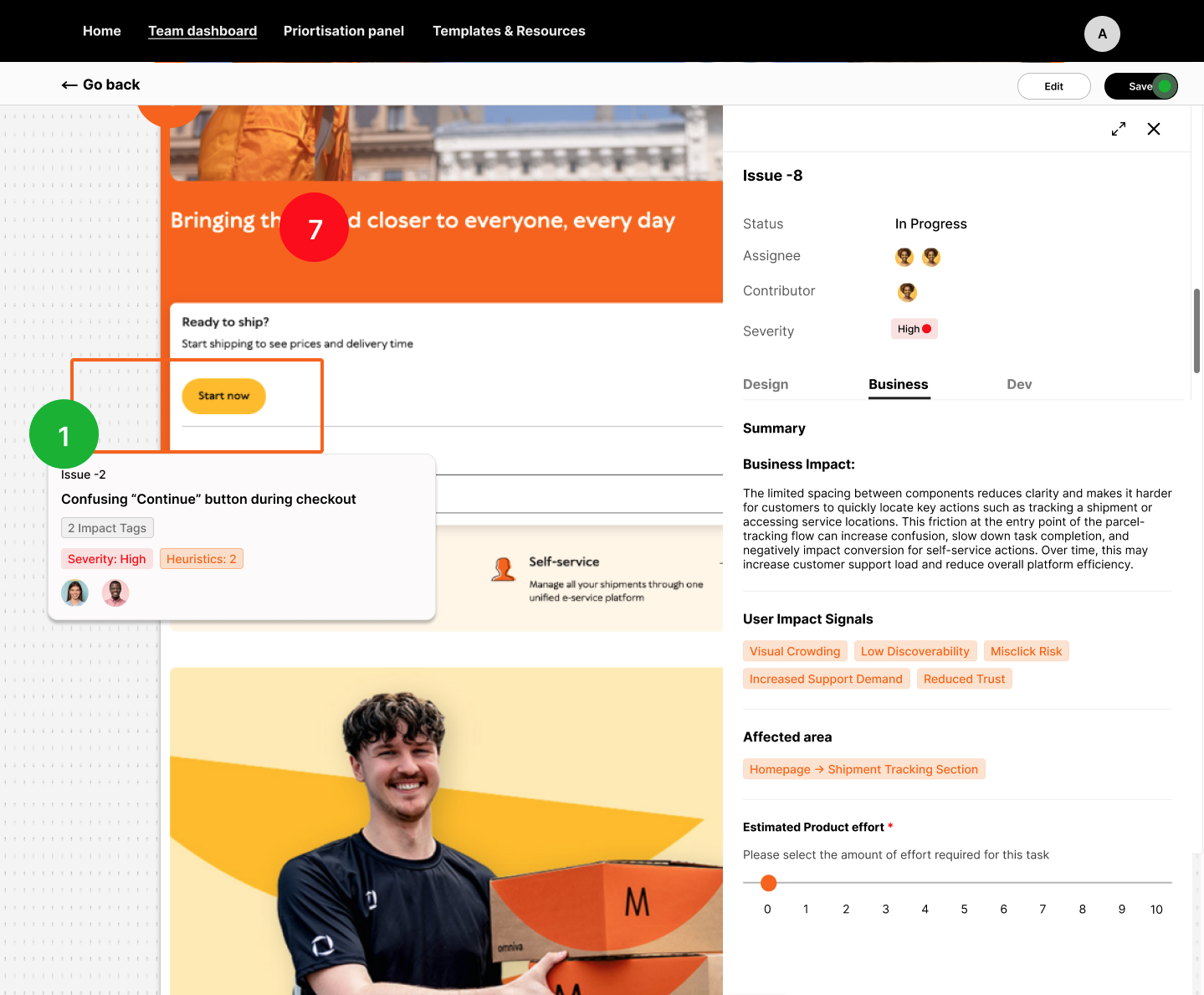
Solution – Each issue included the violated heuristic, a screenshot and a clear recommendation, helping developers understand the problem and how to fix it before implementation.
→ Clear visual language
Problem – Large and unclear reports can make UX findings difficult to understand and communicate.
Solution – The interface uses a simple visual system to make issue severity easy to understand: red for Critical, orange for Medium and green for Low. This helps users quickly see which issues need more attention.
Usability Testing
The design was tested in two stages using low- and high-fidelity prototypes. Early testing helped check the overall structure and identify what needed to be improved before the final design. Participants found the interface easy to use, but some terms and concepts were difficult to understand for users with limited UX knowledge.
The high-fidelity prototype was then tested with two front-end developers with different levels of UX knowledge. The average System Usability Scale (SUS) score was 70 (Grade B), indicating good overall usability. The testing also showed that UX knowledge affected how easily participants understood the platform. Users with less UX experience needed clearer navigation, simpler terminology and additional guidance, such as onboarding and tooltips, while users familiar with UX evaluation could navigate the platform confidently. These findings helped shape the final recommendations for making the platform easier to use for a broader audience.
Outcome
The project redesigned UXMust as a collaborative platform that helps teams understand, prioritise and manage UX evaluation findings. User research and iterative prototyping helped create an interactive high-fidelity concept that makes usability findings clearer, easier to act on and easier to use in existing workflows.
The final outcome was an interactive high-fidelity prototype based on user research and usability testing. The project also provided recommendations for future development, including simpler onboarding, better guidance for users with limited UX knowledge and testing with a wider range of users.